Mapping the damage from rising seas
Can't imagine what your city would look like with a sea-level rise? These maps show endangered coastlines and landmarks. Read More
Coastal areas always have been vulnerable to flooding, but likely will experience increased risk in the future due to anticipated impacts of climate change, such as sea level rise and increased storm and rain intensity.
These climatic changes likely will cause previously vulnerable coastal areas to flood more frequently, and will also allow flooding to reach areas further away from the coast that have not historically been at risk to flooding.
Population densities in coastal regions have increased almost 40 percent in the United States since the 1970s and are expected to rise 8 percent more by 2020, according to NOAA. Therefore, a higher percentage of people will be at risk to flooding and other coastal hazards in the future.
Due to the overall increasing risk of flooding in coastal communities, mathematical modeling has been used to develop interactive maps, which will allow users to “see” specific areas at risk to projected sea level rise and other coastal hazards. These maps may be used by communities to increase public education and awareness about coastal hazards, incorporate impacts of coastal hazards into planning and decision-making about coastal infrastructure, and improve emergency disaster management and safety at the federal, state and municipal level.
Available mapping tools
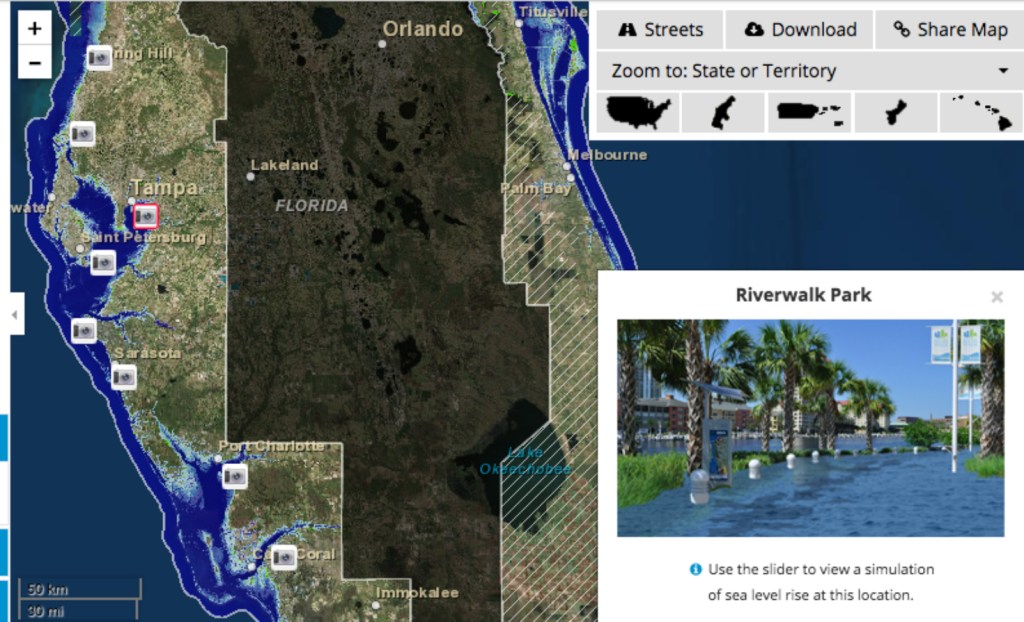
Over the past five years, a few easy-to-use interactive maps showing sea level rise inundation projections and other coastal hazards have become available online. These include Climate Central’s Surging Seas Risk Finder, NOAA’s Sea Level Rise and Coastal Flooding Impacts Viewer and the Nature Conservancy Coastal Resilience mapping portal.

All use some variation on a bathtub model that combines elevation Light Detection And Ranging (LiDAR) data with current sea level data. The bathtub model simply means treating the ocean like a bathtub that fills up the same way that a tub does when you add water — the lower parts fill up first and then the higher parts fill until the water level just keep rising at the same level everywhere in the tub. (LiDAR is an optical remote-sensing technique that can be used for taking coordinate measurements on land from an aircraft.)
In general, these maps show inundation effects on the coast in various geographical areas as a function of elevation and increased water level above the mean higher high water level (MHHW). The MHHW definition from NOAA is the average of the higher high water height of each tidal day observed over the National Tidal Datum Epoch. The maps allow users to add meters to the current sea level to show what could happen if the sea level rose a certain amount due to sea level rise or to storm surge.
Other maps, such as the USGS Coastal Change Hazards Portal and Hurricane Sandy Storm Tide Mapper, provide vulnerability comparisons across states, but they do not show future scenarios for inundation due to sea-level rise or flooding from storm surge.
Some maps also include interactive mapping layers that can be viewed on top of increased sea level projections, such as various storm scenarios or census data. For example, the Climate Central Surging Seas Risk Finder allows users to overlay social vulnerability, population size, ethnicity, income or property-value data over sea level rise projections.
The NOAA Sea Level Rise Impacts Viewer allows users to overlay various sea-level rise scenarios with their impacts on marsh distribution, socioeconomic vulnerability or flood frequency. This also allows users to overlay sea-level rise projections with confidence levels, meaning how sure the mappers are that the model is showing where flooding or inundation will occur at some point in the future.
There are many map layers currently available that are added along with the sea-level rise and storm projections, and there will continue to be more in the future. Over the past year, these maps have changed and evolved drastically by adding additional layers, and they will likely continue to do so in the future.
How should these maps be used? Visualizing uncertainty
Sea-level rise maps indicating areas potentially prone to future inundation are valuable tools for decision makers. Interactive maps can be used as outreach tools to increase public education and awareness about coastal hazards or to evaluate areas that are vulnerable to coastal hazards on larger geographical scales (global, national or state). They allow users to explore which areas have low-lying elevations and are therefore more vulnerable to coastal hazards (for example, they can clearly show that Florida is more vulnerable than most other U.S. states due to its low-lying elevation).
These maps are also very good for providing education on the effects of sea-level rise. However, higher resolution mapping is needed to make specific decisions at the local level, for example, at the scale of siting a building or energy substation. This is partially because the sources of error and specifics about the amount of error in the models and data are often underrepresented when people look at these maps, often due to difficulty visualizing and explaining uncertainty.

Uncertainty means that sources of error make it challenging to know the exact answer to something, in this case where flooding will occur. There is uncertainty built into models for projecting future sea-level rise or storm surge from a hurricane, for example, as well as the data inputs used to topographic maps. Uncertainty in topography, for example, means that the vertical rise may be incorrect and therefore the areas that are vulnerable to flooding may be incorrect. Uncertainty in the models for sea-level rise and storms impact how much water would be predicted to be present under a certain scenario.
On a map both of these factors are combined to show flooding and therefore the uncertainty is also compounded. However, scientists have ways to know those errors are and how they might impact their findings, so even if they cannot give one exact value, they can tell you a range in which the true number will definitely occur. For example, they can tell you that flooding is highly likely to occur in a certain area on a map. However, mapping this type of uncertainty for the public remains a challenge.
Other factors that are not well represented by most flood maps are natural shoreline change (erosion and accretion) and coastal response that occurs over time. The models shown in the maps may not have been tested for accuracy during real storms or account for future changes in forcing conditions (such as storminess, precipitation, and wave action).
Coastal systems are complex; the models used may not account for all factors that influence coastal change and hazards, and therefore cannot predict future inundation with full accuracy. The bathtub models do not account for factors such as sediment supply, offshore geology, engineering structures, rivers, tidal flushing, tidal gates, storm energy and wave forcing, all of which contribute to making the shoreline response to sea-level rise “much more complicated than a simple drowning alone” (PDF), as a 2007 paper by the Woods Hole Oceanographic Institution put it.
In addition, driving forces of waves, currents, tides and sea-level fluctuations are dependent on the local geological framework Therefore mapping needs to be done at the local level and account for local hydrology to be accurate.
Translating uncertainty in the data sets and models to an interactive map that’s visually appealing and easy to navigate is not easy. To address this, some of the maps have created disclaimers that explain their caveats and uncertainties. The NOAA Sea Level Rise Impacts Viewer’s pop-up disclaimer is the first thing you see before you can view the map. It clearly states that this is a “preliminary” and “screening-level tool” and should be used to “illustrate the scale of potential flooding, not the exact location,” and finally stating “this tool should be used strictly as a planning reference tool and not for navigation, permitting, or other legal purposes.”
Even with taking such precautions as NOAA did, some map users may not read the disclaimers and therefore do not understand that accuracy challenges may cause problems. These interpretation problems might include, for example, a member of the public using the map to look at their specific home or when a town emergency manager wants to knows if the hospital needs to be moved out of a vulnerable area. Uncertainty in the models and data used to map coastal hazards is too high to be making important decisions, not just planning documents, on such localized scales. The uncertainty in a model may be higher or lower for the specific place that you are looking at, and if the extent of uncertainty in the model is not provided or visualized at that specific location, then you should not assume that the map is perfect. For example, if your neighbor’s house is flooded in a certain mapped scenario, don’t assume yours will not be next door just because the map does not show it. As the NOAA disclaimer states, “all features should be verified with a site visit.” In other words, local data is needed to move from planning to implementation of a real project.
Overall it is important to be aware that the models may not predict the exact shoreline response and change that will occur with sea-level rise at a highly local scale, but they are a useful tool to raise awareness and educate the public on the impacts of climate change (such as sea-level rise, storms, and increased precipitation).
Adaptation and mitigation techniques such as land-use policy reform and resilient building have become important topics of discussion in coastal communities along with the increased need for public education on flood risk.
With future sea-level rise and flooding in mind, it is important to find cost-efficient ways to decrease the economic and social impacts of flooding to coastal buildings, homes and infrastructure. Maps provide a preliminary look at whether an area is likely vulnerable to flooding hazards. The guide below gives a brief description of map viewers currently available for the public.
A users guide to interactive sea-level rise maps
Coastal Resilience Mapping Portal by The Nature Conservancy
Purpose: To visualize potential impacts from sea-level rise and other coastal hazards over time. This map was designed for local and state decision makers to help communities develop and implement solutions that incorporate ecosystem-based adaptation approaches to coastal hazards. Ecological, social and economic information can be viewed alongside sea-level rise and storm surge scenarios in specific geographies.
Data Layers available: Sea Level Rise, Infrastructure, Land Use/Zoning, Natural Resources, Socioeconomic data
Inundation Model Used: Bathtub fill approach and hydrologically enforced inundation modeling in some areas, HEC-GeoRAS tool in ArcGIS outputs for river flooding, FEMA overtopping model used results projected against topographic surface composite
Horizontal Accuracy: +/- 1m
Main elevation data source: 2009 – 2011 California Coastal Conservancy Coastal LiDAR Project Hydro-Flattened Bare
Main elevation data source vertical accuracy: +/- 9cm
Sea Level Rise and Coastal Flooding Impacts Viewer by NOAA
Purpose: To provide a preliminary look at sea level rise and coastal flooding impacts in the U.S. for coastal managers and scientists, and to provide a national consistent viewer with open access to the data local communities need to address their needs.
Data Layers available: Sea level rise, Confidence in Mapping, Flood Frequency, Socioeconomic data, Marsh Impacts, Photo visualizations of key landmarks
Inundation Model Used: Uses LIDAR elevation data and locally adjusted MHHW levels to model hydrologic connectivity with a modified bathtub modeling approach.
Horizontal Accuracy: +/- 5 meters
Main elevation data source: LiDAR – The LiDAR data used by NOAA is more accurate in some areas that are mapped that others. In areas with 95 percent confidence, the elevation data accuracy is typically better that 30 cm.
Main elevation data source vertical accuracy: NOAA/USGS specs 9.25cm RMSE
Surging Seas Risk Finder by Climate Central
Purpose: To provide visualization of coastal areas on a national geographic scope that would be vulnerable to increased sea level (foot increments from 0 to 10ft) above base sea level elevation (locally adjusted Mean Higher High Water levels – MHHW). Designed for use with supplementary tool which provides more complete vulnerability analyses.
Data Layers available: Sea level rise, social vulnerability, population size, ethnicity, income, property value
Inundation Model Used: Uses LiDAR elevation data and locally adjusted MHHW levels to model hydrologic connectivity with a modified bathtub modeling approach
Horizontal Accuracy: +/- 5m
Main elevation data source: LiDAR
Main elevation data source vertical accuracy: NOAA/USGS specs 9.25cm RMSE

U.S. Geological Survey’s Coastal Change Hazards Portal by USGS
Purpose: To provide a national vulnerability comparison across U.S. states to three coastal hazards: 1) severe storms, 2) shoreline change, and 3) sea-level rise. These tools should only be used to look a risks of coastal change on a large geographical scale and not at the very local level. It can be used to compare one state’s risk to the risk of other states.
Data Layers available: Coastal hazard vulnerability for severe storms, shoreline change, and sea-level rise
Inundation Model Used: No inundation model used, maps vulnerability to sea level rise, shoreline change and severe storms
Horizontal Accuracy: N/A
Main elevation data source: N/A
Main elevation data source vertical accuracy: N/A
Hurricane Sandy Storm Tide Mapper by USGS
Purpose: To show visually on a national map the storm surge from Hurricane Sandy 2012. This map can be used to look at Hurricane Sandy inundation. Many areas that were mapped have been verified. Be aware that this was one severe weather event and that future inundation will not occur in all the exact same places in the future.
Data Layers available: Hurricane Sandy Storm Surge
Inundation Model Used: N/A
Horizontal Accuracy: +/- 10 ft.
Main elevation data source: N/A
Main elevation data source vertical accuracy: Vertical accuracy is 0.26 foot at the 95-percent confidence level except for the following counties in New Jersey: Union, Middlesex, and Monmouth Counties which data has a 0.47 foot vertical confidence level at the 95-percent confidence level
Connecticut Coastal Hazards by CTDEEP, UCONN Marine Sciences, & NOAA
Purpose: (Editor’s note: This map is included as part of this article’s original focus on Connecticut.) To provide visualization of sea-level rise and hurricane storm surge inundation scenarios in Connecticut for coastal community planning/illustrative purposes.
Data Layers available: sea level rise, high-resolution coastal elevation, hurricane storm surge, coastal erosion, and environmental observations
Inundation Model Used: Inundation scenarios are based on LiDAR elevation data and regional/global sea level rise estimates for year 2020, 2050, 2080, and 2100
Horizontal Accuracy: N/A
Main data source: LIDAR and Coastal Connecticut 3ft Digital Elevation Model (DEM)
Main elevation data source vertical accuracy: N/A