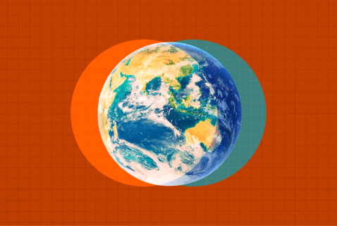
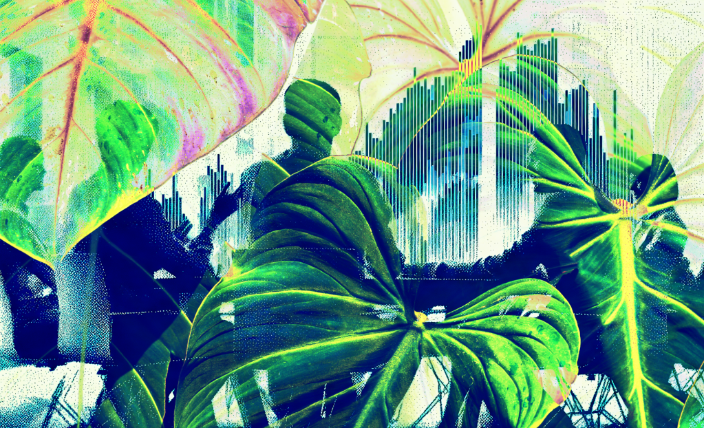
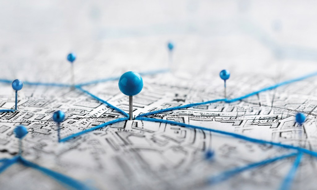
Mapping sustainability means connecting the dots
The quest for a picture that's worth 1,000 words. Read More
Shutterstock
I’ve long been a fan of maps. In my youth, I liked to curl up with roadmaps — the kind they used to give away at gas stations — to peruse my world: where I was, where I’d been, where I might want to go, the proximity of different places, the connectivity of everything.
In short: the lay of the land.
It was one way of making sense of my world — of getting the big picture, literally.
In the 1980s, I authored a series of reference books called “The Map Catalog,” about “every kind of map and chart on earth and even some above it,” as the subtitle kindly explained. It explained and provided resources for dozens of types of maps: roadmaps; aerial maps; geological maps; historical maps; agricultural maps; weather maps; nautical maps; military maps; census maps; transit maps; ocean maps; and many more.
It was my attempt at the time to create, in effect, a map of maps.
Why maps? As I learned early on, they enable us to quickly visualize large amounts of information. “A mere three-foot-square map can contain thousands of pieces of information on an endless number of topics,” I wrote in the book’s introduction. (This was back when maps were produced primarily on paper.) A good map puts things into clear and concise perspective, showing us where we are, literally and figuratively, and our relationship to other places and things. Individually and collectively, they tell a story of our world in ways that words often fail. Some are even works of art.
Since the publication of the third and final edition of “The Map Catalog,” in 1992, the world has changed mightily, and so has mapping. Now, of course, it’s all digital and much of it is interactive, with rich layers of data that can be added and subtracted, zoomed in and out to provide the information and perspective needed at any given moment.
And mapping, thanks in large part to digital tools, has enabled us to view things other than geography and demographics. For example, there is an entire genre of mind-mapping software that helps organize ideas. There’s genome mapping, providing new insights into human health and well-being. Communications firms are adept at issue mapping to help clients understand their risk and reputational surroundings.
Changing landscape
So, why this summertime paean to cartography?
I’ve been thinking a lot about how to map the world of sustainability in a way that shows how environmental and social issues align increasingly with one another as well as with business and financial issues. As you well know, the number of topics faced by sustainability professionals inside companies has mushroomed over the past two decades, from simply worrying about waste and pollution to fully embracing all aspects of the health and well-being of humans and other living things, all while tracking progress with financial and nonfinancial metrics.
Putting all this into a visual representation is tough to do. I know, I’ve tried.
And it’s no mere intellectual exercise. For a company, understanding the landscape has become critical to staying on top of an ever-shifting world. That includes knowing how seemingly disparate issues connect to one another, both inside and outside organizational walls: how biodiversity loss connects to human health, for example; or the linkages between water scarcity and social justice, just to name two. A good map will connect dots that hadn’t necessarily been connected.
I’ve been watching others’ attempts to do this in the sustainability space. For example, consider Jefferies, the financial services company. It has been issuing a regular — almost daily, it seems — output of insightful ESG reports, whitepapers and analyses. Last week, it released a report titled “The Future of ESG — Twelve Ideas,” which offered “actionable recommendations for investors and corporates, supported by experts in the ESG space.”
I won’t take you through the dozen “ideas,” some obvious, others less so. But I was struck by the map of “mega trends & themes” that opens the report. It’s a respectable attempt to plot the interrelationships among demographic shifts, climate change, urbanization, technological transformation and geopolitical tensions.

Like most such efforts, this one is highly imperfect and reflects the biases and worldview of its authors. It also fails to adequately connect the dots. For example, there is much more in Jefferies’ rendering that could be linked to income inequality — food transformation, the future of mobility and smart cities, among others. “Social responsibility,” as shown on this map, connects only to the circular economy, not to such things as water scarcity, cybersecurity or climate change.
Jefferies’ ESG map is hardly the only effort to show the interrelationship among various societal, environmental and business issues. The nonprofit formerly known as SASB, now part of the Value Reporting Foundation, has compiled a comprehensive materiality map, showing how 26 sustainability issues “are likely to affect the financial condition or operating performance of companies” within 11 sectors and more than 75 subsectors, from media to meat production.
It, too, is imperfect in that it doesn’t necessarily show the relationship of these issues to one another. Same with the annual Global Risks Report produced by the World Economic Forum, which features a “global risks landscape” — a standard two-by-two graph plotting the impact and likelihood of global risks over the coming decade. It shows the relative relationship of these risks, but not necessarily their interconnectedness.
Connecting dots will become increasingly important in a volatile, dynamic and unpredictable world. Even more so because the remit of today’s sustainability professional isn’t likely limited to just environmental issues. They are required not just to understand a broad range of issues, with new ones cropping up regularly, but also to contemplate their interrelationships and tradeoffs, as well as their impact on the company and its suppliers, customers, employees and others, not to mention its bottom line. Looking at individual issues in isolation just doesn’t cut it anymore.
So, what’s a good sustainability map you’ve seen — or maybe created yourself? It needn’t be something my younger self would have wanted to curl up with on a rainy afternoon. And it needn’t be slick or colorful (although compelling rendering helps).
I welcome your suggestions and submissions and will feature the ones I like in an upcoming column.
I invite you to follow me on Twitter, subscribe to my Monday morning newsletter, GreenBuzz, from which this was reprinted, and listen to GreenBiz 350, my weekly podcast, co-hosted with Heather Clancy.