The entire U.S. energy picture depicted in (almost) one chart
Last year, 66.4 quads of energy, or more than two-thirds of the total energy consumed, was rejected or given off as waste heat. Read More
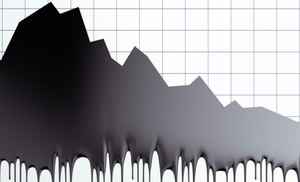
Lawrence Livermore National Laboratory has released its annual U.S. energy consumption chart.

Yes, it looks like spaghetti, but it contains a lot of useful information. It shows, on one page, how much energy we used in 2016, and specifically, what sources we got it from and what we used it for.
For starters, it stated that we used 97.3 quads, which is short for quadrillion BTU’s. That’s a lot of energy. As Dave Roberts points out in Vox, that’s equivalent to 8 billion gallons of gasoline of 36 million metric tons of coal. It’s also the same amount that we used in 2011 and 2.2 quads more than we used in 2012.
However, in 2012, we used 17.4 quads of coal, 26 quads of natural gas, 34.7 quads of petroleum and 4.512 of renewables. Compare that with last year, where we used 14.2 quads of coal, 28.5 quads of natural gas, 35.9 quads of petroleum and 5.407 quads of renewables. These four sources account for the bulk of the difference.
Perhaps the most startling information is found on the upper right-hand side of the chart. That’s where it shows the amounted of rejected, or wasted energy (an excellent measure of efficiency) and the amount of useful services received from all that energy.

As you can see, last year, 66.4 quads of energy, or more than two-thirds of the total energy consumed, was rejected or given off as waste heat while providing only 30.8 quads of useful energy services. Every device that uses energy converts it from one form to another and in doing so, loses some in the process.
What is perhaps the biggest surprise, when comparing the two years, is that we actually received 6.2 quads more in energy services, in 2012 than we did last year, despite consuming 2.2 quads less in total. Our economy’s efficiency in 2012 was 38.9 percent, not great but considerably better than the 31.7 percent it was last year.

How, you might ask, can that be when automobile fuel economy has improved so much and so many of us are using high-efficiency light bulbs and smart thermostats? While there is no simple answer to this, a primary reason is because of the kinds of energy being used. Despite higher fuel economy, we are using quite a bit more petroleum because more people are driving more miles in bigger vehicles.
A big reason for that is the decline in fuel prices. The same is true for electricity. As it turns out, electricity production and internal combustion engines are among the most inefficient energy systems on the planet, so the fact that we are using proportionately more of them is why we are getting less for more.
These facts lend support to the Jevons paradox, a hypothesis credited to the 19th century English economist William Jevons, who basically said that making something more efficient will not reduce consumption. Jevons reasoned that improving efficiency leads to reduced demand for the fuel on which the process depends. (He was talking about coal-fired steam engines at the time.) Reduced demand leads to lower prices, which, in turn, leads to more consumption.
The hypothesis remains controversial to this day. Most analysts concede that it does play a role, although there is little agreement as to how much.
If we remain on the path we’re on — phasing out more coal, adding renewables and switching to more efficient vehicles (and fewer drivers) — the efficiency should go up. Electric cars move down the road between 3 to 3.5 times more efficiently than their gas-powered equivalents. However, their ultimate impact depends on where the electricity comes from.
As both vehicles and power plants continue to undergo the kinds of changes already taking place, as well as significant investment in smarter, more efficient buildings, we can expect to see significant improvements in efficiency. However, given the alarming rate of warming occurring, those improvements can’t come quickly enough.


